Web UI for CRM (MyAfton)
I recently worked with the booking staff for MyAfton and Afton Shows system on overhauling the layout and styling of the Web UI for two seminal screens in our custom CRM tool (which was just rebuilt to integrate full email client functionality via IMAP, at my recommendation). The booking staff was unsatisfied with the UI that resulted from the work of the consultant they had acting as project manager, so they asked me to mockup a proposed alternat UI design for two screens:
- Reply to Email from Pending Artist ("PENDING")
- Reply to Email from Confirmed Artist ("CONFIRMED")
My Role as UI Designer
I typically do UI/UX wireframes and then work with production designers and front end developers to settle on the pixel-level styling and layout of the functionality I first illustrated. This project though stretched me to go a step further.
The project manager on this project (not me) was trying to accomplish the project with as little designer time as possible, and the stakeholders were not happy with the results. My role was to discuss various factors and priorities with the stakeholders create a flat mockup of each screen of UI that would guide the front end developers to deliver markup in the live Web app that would satisfy the stakeholders.
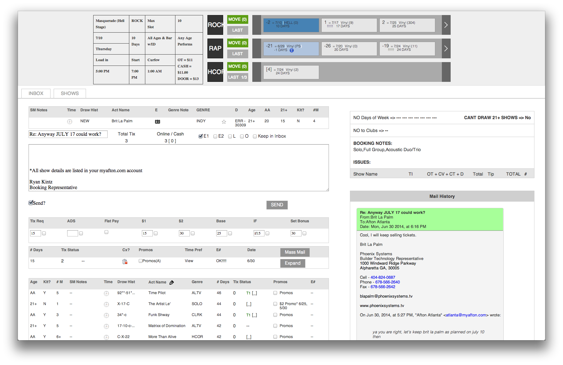
Starting Point
When I was asked to step in and lead UI design for these two screens, they looked like this:
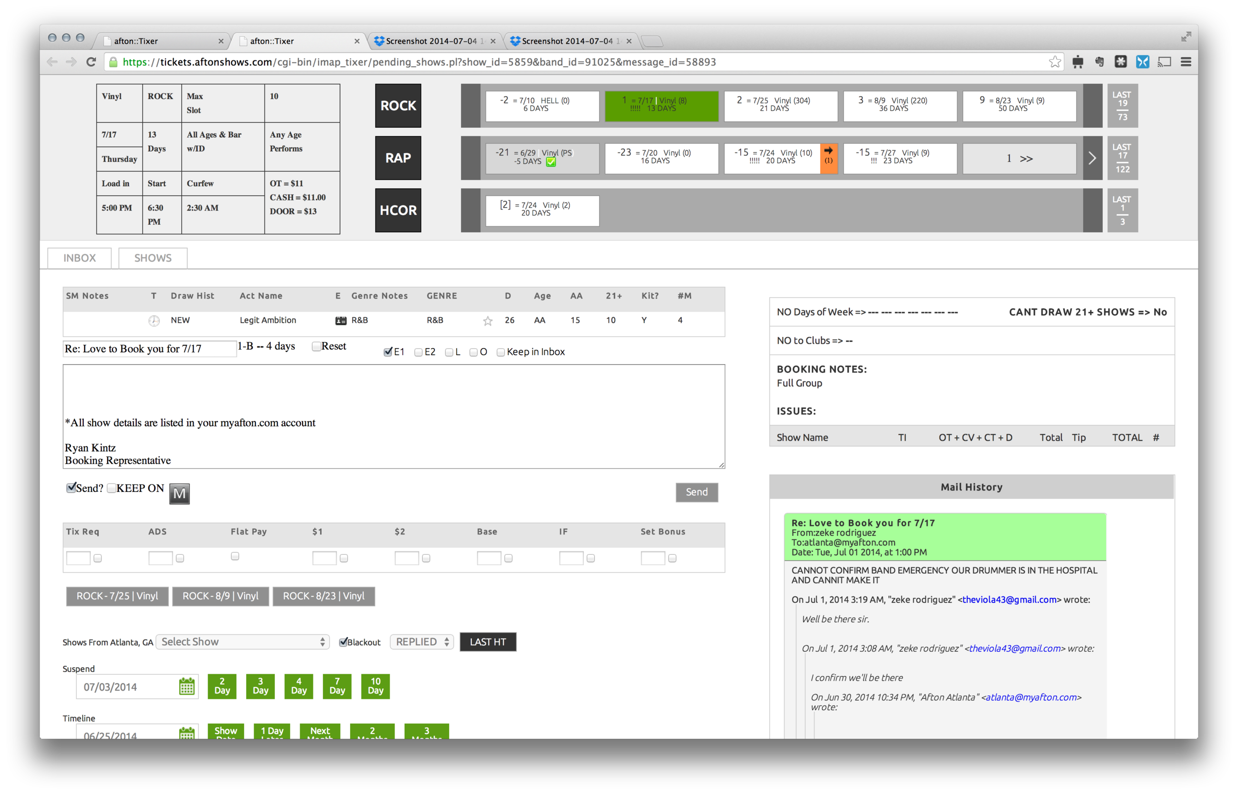
My UI Design Mockups
I did a first draft mockup of one of the two screens and then met with the two stakeholders (the booking staff). There was a lot of legacy paradigms that the stakeholders were married to, which was limiting a bit. But I made a case for the changes I thought offered tangible benefits regarding clarity and speed of user tasks — most of which was well received.
The one major disagreement we had was that the two stakeholders wanted practically every piece of text or UI element in any table to be center aligned. On this point, I pretty quickly capitulated, because these screens will never be used outside the company and these two stakeholders represent 95%+ of the usage it will get over the next year, at least. Since they were adamant center-alignment was what they wanted, I was happy to give it to them.
Below are the final UI design mockups that I delivered to the developers for this project, after the process of incorporating feedback from stakeholders.


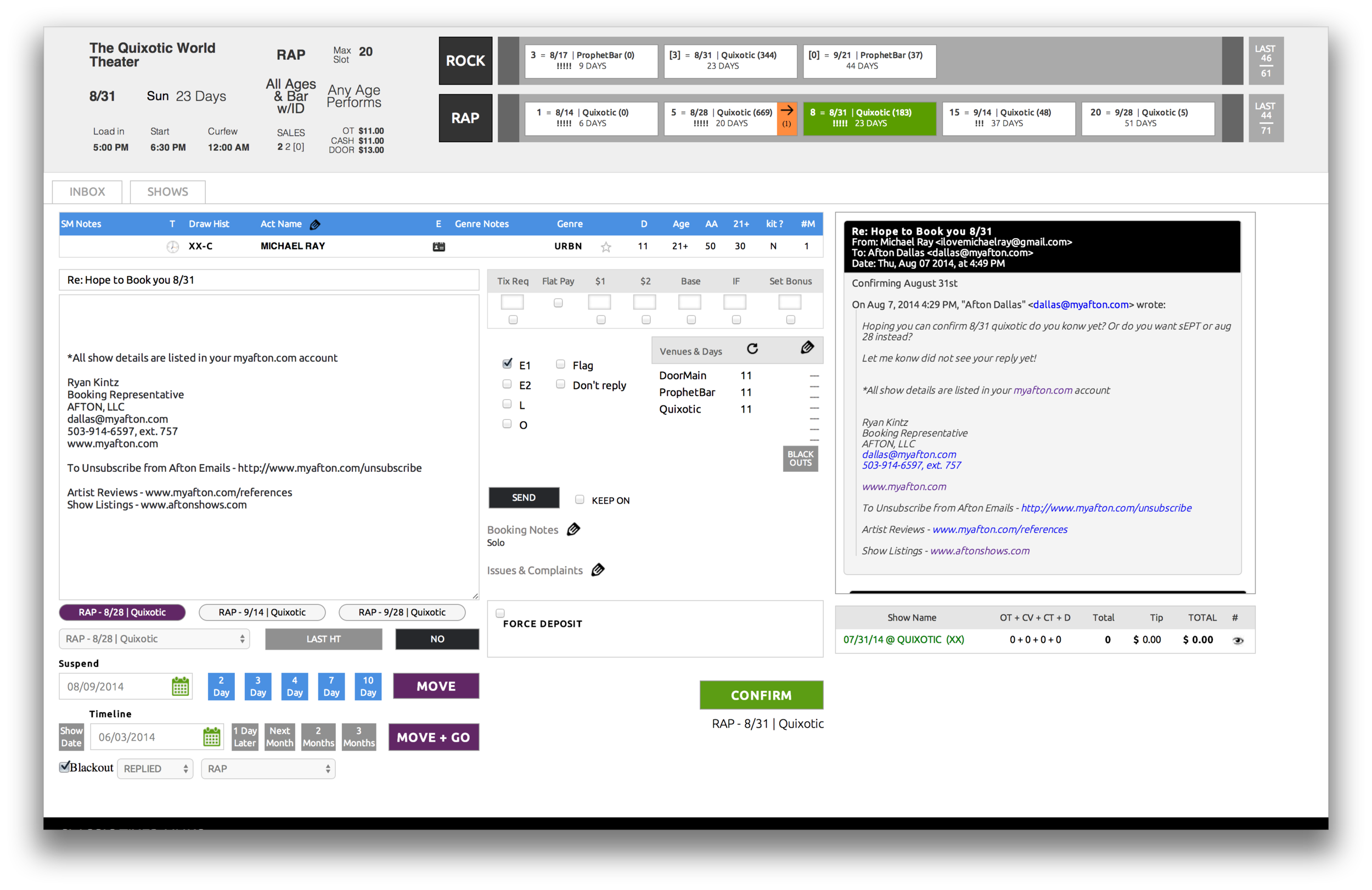
Resulting Web Pages (Markup Viewed in Browser)
After a few rounds of feedback from the stakeholders and project manager (not me) on the work the front end developer did based on my mockups, the final Web pages for these two screens of UI are as follows:

UI Design Work Sample Documents
Here is a link to screenshots from before I became involved in the project, my flat UI design mockups (which were passed to a front end developer creating final markup for use in the app), and screenshots of the final Web pages settlend on by the stakeholders and project manager (not me).